Everything you need to know about Analytical Visualisations
It’s a complex world out there. Every day the volume and complexity of information we have to digest increases. New data and technologies (e.g. the IoT - internet of things) are making the situation worse. Once it was just people interacting with businesses and each other, now machines are interacting among themselves as well.
Getting your head around these complex systems and the sheer volume of data is near-impossible. We need ways to present information that enable us to take in what we need without getting trapped in the detail.
We also still need to make informed decisions so that we can take the appropriate courses of action. The accepted way of going about this is to understand the problem, digest the information, make a decision, and get on with it. If we leave out any of these steps, we’ll never know for sure if we’re making progress.
Data Visualisation
Data Visualisations (DV) are great tools for understanding and digesting information. There have been some solid advances with DVs, including Tableau and Microsoft’s PowerBI, but these tools tend to be used in reporting (sometimes called Business Intelligence or BI) and end up as management reports. These reports are useful the first couple of times, but more often than not they start gathering dust on a shelf in the office because they are simply not providing the insights that are needed these days.
Analytical visualisation
Analytical Visualisation (AV) is different to Data Visualisation. An AV passes through statistical and AI processes to detect the underlying features and value in the data. AVs enable you to look at more than a couple of variables at a time and assist the human brain in cutting through to gain true insights.
There are four steps in Analytical Visualisations:
1. Understanding the organisation objectives
2. Getting the data together
3. Carrying out the analysis
4. Visualising and interpreting the results
Tools to use
ClientView is one tool we have used over the years to cut through the complexity of relationships, the volume of data and the endless reporting. It is a form of AV that enables you to boil down the complexity of your business and the data you have – so you can understand what is happening, make informed decisions, and measure the effect of your actions.
Although we mostly use ClientView to understand current makeup and changes to customer bases, we also use it across a diverse range of other applications, including asset management, banking transactions, inventory tracking, benefit uptake and fraud detection.
ClientView uses statistical, machine learning and mathematical methods to explore and identify features within the data and entities supplied. Once identified, the visualisation enables the user to explore the analysis. You are not just looking at a few variables at a time, but a complex combination of your entire customer base, including demographic and behavioral interaction data.
Data Visualisation Working Example
Let’s take you through an example where you are in charge of a DIY business with 200 stores, millions of customers and over 100,000 product lines. The business is going well, but there is fierce ongoing competition for customers. You don’t have a firm handle on what is happening within the customer base or how customers are interacting with you. The data you store is sizable, with billions of rows across dozens of different tables. Trying to manage all this information in your head is impossible.
Data visualisations and reports are helpful, but limiting. They only enable you to focus on a few variables at a time, and to look only at what the reports have been set up to look at. Understanding changes over time is difficult and hence few insights are provided on an ongoing basis.
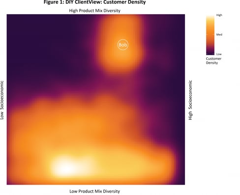
Figure 1 - Customer Density shows where your customers lie on the chart. The colours represent the number or density of customers (bright colours more customers, dark colours fewer customers). There are two main areas with lots of customers – the bottom mid-left corner and near the top right corner.
The axes in Analytical Visualisations are derived from a combination of the organisation's objectives and the patterns detected in the data. The ClientView process involves application of the analytics and AI techniques to find the projections that best suit the objectives.
In this example, the areas on the graph represent different types of customers with different buying habits. Customers towards the left-hand side of the chart are more likely to live in lower socioeconomic areas, and the ones towards the right in higher socioeconomic areas. Customers in the lower areas of the chart have low product diversity (they only purchase from a small range of product types), while customers at the top of the chart are more diverse in their product purchasing.
 To illustrate this, let’s say that you (Bob) are in the higher customer density area near the top right of Figure 1. You are a customer that has a high level of product diversity (you like DIY and get into a lot of different projects). Customers remain in the same location for each of the charts so that you will remain in the same position for the next two charts. In your case, you (Bob) are in the same spot for each of the charts.
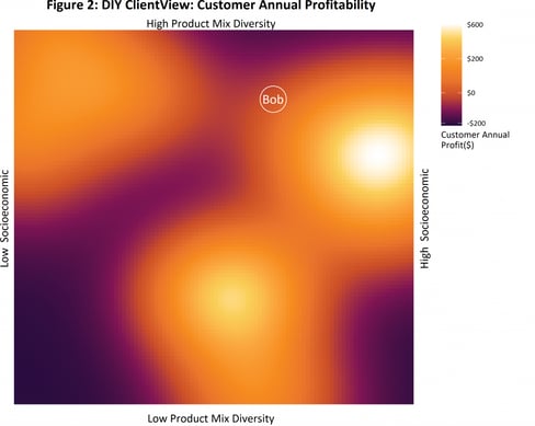
Figure 2 Customer Annual Profitability shows where customer profitability comes from. The scale on this chart ranges from losses per customer of $200 per year on average (dark areas) to profits of $600 per year (bright areas). Remember that your customers are in the same locations on each of the charts, so your lower socioeconomic and low product mix customers are costing you money – perhaps because they are simply cherry-picking your specials. In general, customers with a higher product diversity mix are more profitable.
To determine your DIY overall profitability you would simply combine Figure 1 with Figure 2 or multiple customer density by customer profit. In this case, you have plenty of customers at the bottom of the charts, but you are losing money from those customers.
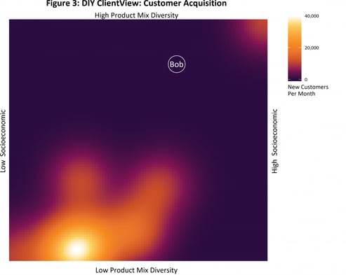
Figure 3 adds to the story, showing where new customers come from. It’s not looking good for your DIY chain, because most of your new customers are in the area where you are unprofitable – and you are not acquiring many profitable customers.
Enhance the insight and take action
Additional charts could provide other useful customer insights:
- Total customer profitability (as discussed above)
- Where you are losing customers
- What is the product mix of your profitable customers?
- Customer share of wallet
- What types of customers did we pick up off that last campaign,
and - What changes have happened over time, e.g. what is the customer journey for profitable customers?
From the Analytical Visualisation, the DIY business would be able to make the following types of decisions, act on those decisions and then be able to measure the effects in the future:
- Where to target new customer acquisition
- The product mix to promote, attract and reward high value customers. Review and revise product pricing decisions
- Determine what types of products to add to the range and which ones to drop
- What types of customers loyalty programmes need to target, and which need to be rewarded (and what with)
- Identify and fast-track potential high value new customers
In Summary
AVs can be used to gain further insight by targeting customers, identifying changes over time and introducing new information (e.g. net promoter score and other research). Visualisations of other variables are also possible – for example: product margin, changes in customers over time, new product pull and the effects of advertising changes.
Analytical Visualisations are quickly becoming the go-to tool for identifying and looking at what’s happening within your data in relation to your business objectives. I know our clients get great value out these techniques, so next time you need a complex set of questions answered, have a chat with your friendly data scientist about unlocking the secrets that are most certainly hidden within your data.
In the meantime, download our free Guide to Creating Customer Insights to learn more.