
Tableau vs. Power BI - The importance of data visualisation in a post-pandemic world
All businesses have been significantly impacted by COVID-19, and everyone is desperate for information right now – not just any information, but actionable, insightful information that answers questions like these:
- Has our customer base changed?
- Are we still offering the right service or product range?
-
Where are our customers travelling from, and are they travelling further?
Dashboards are an incredibly useful way to convey the info you have. You might have hundreds of millions of transactions or pieces of customer information in your database, but without the proper skills it’s difficult to derive tangible meaning from that data. Dashboards and reports help summarise the vast quantity of information you’ve collected in an actionable way, even for people who aren’t highly technical.
 Datamine is technology agnostic, meaning we don’t operate within the confines of specific tools, so we’ve been around the block when it comes to two of the most well-known data visualisation tools: Tableau and Microsoft Power BI. Here’s our take on the benefits and drawbacks of both tools, as well as some suggestions for how to choose between the two and what types of initiatives they’ll be useful for in the post-COVID-19 world.
Benefits and drawbacks of Tableau
Here are some of the most notable benefits of Tableau:
- Tableau is able to query multiple databases directly, leveraging the resource of the database server
- It can connect to a large variety of different data sources, and multiple data sources at the same time
- Data from different sources can be blended inside a workbook without the need for an external job to merge disparate data sources
- The server product is great for storing and refreshing extracts of data
-
It’s easy to share reports externally with non-technical users
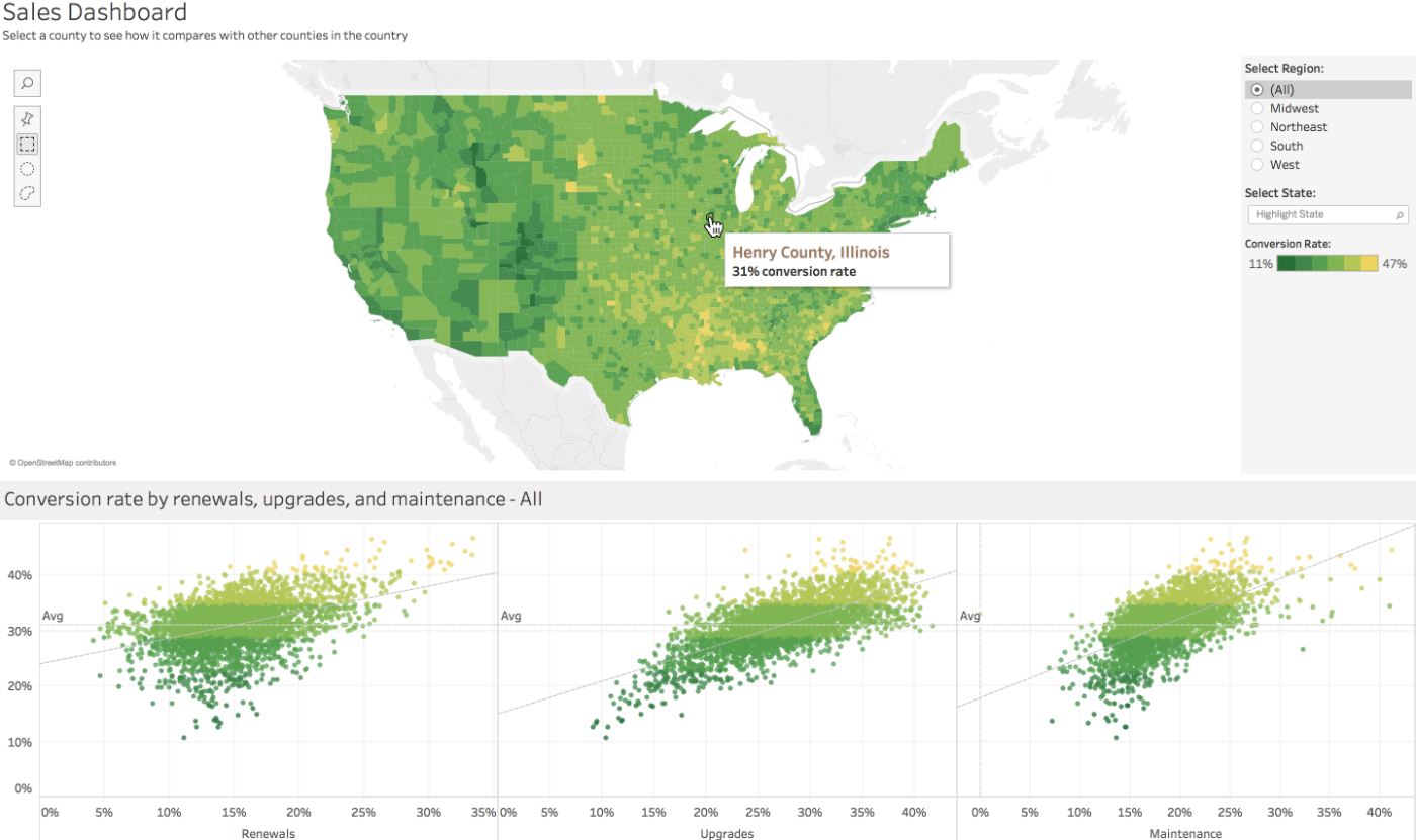
Tableau is especially great for visualising maps, such as for network or catchment reporting – it handles higher density shape information than Power BI, thanks to its ability to simplify shapes to a resolution appropriate to level of zoom on a map. The fact that it can connect to multiple different types of data sources also plays a significant role in whether or not we choose to use it, depending on the requirements of the specific situation.
Now for some of the biggest drawbacks of Tableau:
- Tableau is expensive, and it doesn’t have a free version for authoring workbooks
- Although slightly more flexible, it tends to be difficult to learn and requires greater technical expertise – it’s harder to start with, but it’s easier to master
-
Tableau has a good range of visualisations built in but isn’t as flexible when it comes to producing custom visuals
One of the issues that comes up most for some of our clients with Tableau is the price – it isn’t a cheap tool, and the fact that there is no free trial means the barrier to entry is high. Tableau has a reader product that allows you to distribute workbooks for free, but you can’t actually create anything unless you purchase a license.
Benefits and drawbacks of Power BI
Here are some of the most notable benefits of Power BI:
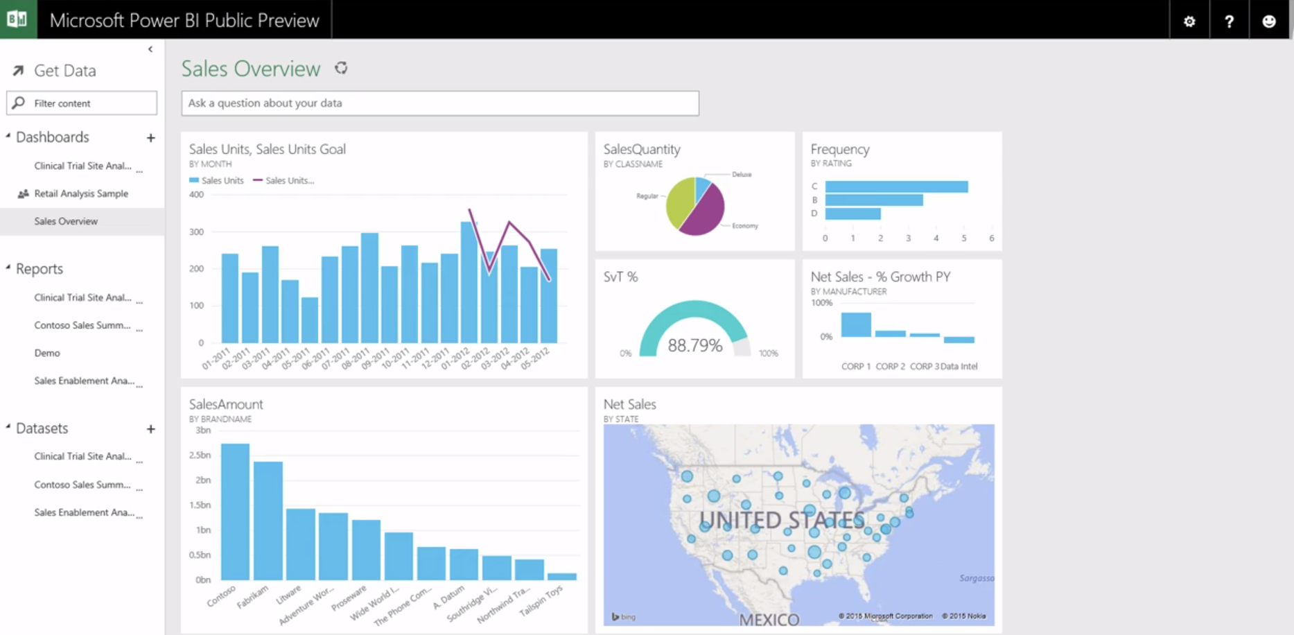
- Power BI is easier to learn, and more familiar to users of Microsoft Office products
- The reports are easy to embed
- The paid version is less expensive than Tableau, and there’s a free version
-
Custom visuals are easily available through the Microsoft app store, or through custom D3 modules (if you feel like getting your hands dirty!)
One of the biggest benefits of Power BI is that it integrates with other Office products, which is useful for people who are familiar with the Office Suite already. Another reason why some clients opt for this tool over Tableau is that anyone can download the free version of Power BI to trial it out. Both Power BI and Tableau can harness the power of R and Python to extend the analyses available out of the box, but Power BI has a much simpler setup and is more reliable than the Tableau implementation.
The drawbacks of Power BI include the following:
- Power BI connects to fewer data sources than Tableau
- Only some of the data sources are supported through DirectQuery, making connection to large datasets in unsupported data sources difficult
-
Power BI is easier to start with, but it’s harder to master
One issue with Power BI has to do with connecting to large databases and reconciling client-side processing and server-side processing – with some sources, the application tries to drag the whole database onto the computer you’re using rather than processing it on the server, which can make the computing quite slow or impossible.
How to choose between Tableau and Power BI
When we build dashboards and reports for clients, our first step is to understand their database technology, budget and visualisation needs before recommending a tool. How technical an output does the client want to produce? Some tools will be designed for technical teams and others for non-technical teams, so it’s important to make sure the tool is the right fit for the end user.
 Similarly, we always consider what types of data do we need to tie into the visualisation. For example, if a client’s database is built in MySQL (which doesn’t play that well with Power BI), we’d probably recommend Tableau – on the other hand, if a client is looking for a snazzy visualisation on a budget and doesn’t need to tie in multiple data sources, we’d probably recommend Power BI.
How Datamine uses Tableau and Power BI for clients
We’ve been using data visualisation tools like Tableau and Power BI since 2013 and have created hundreds of reports and dashboards for clients, such as the following:
- Catchment models and network maps to help make decisions about store performance and locations
- Churn management dashboards to better understand and manage attrition
- Share of wallet and market share reporting
- Profitability and Store Level KPI reporting
- Customer experience and engagement reporting (using NPS score, for example)
- Opportunity and gap analysis to quantify expansion opportunities by geography
-
Customer demographic dashboards
A number of these dashboard types are particularly useful at the moment, most notably those around stores and customers – what types of customers are you currently attracting, and are they different from before? Who is at risk of churning, and how can you retain them? What stores are performing best now compared to before, and does the data indicate it will be a sustained change?
Both Tableau and PowerBI are useful tools for visualising your data to help you and key stakeholders understand the changed landscape and make quick, well-informed decisions. Let us know if you need a hand and we’d be happy to have a chat – otherwise, here’s a case study outlining a customer insights dashboard we built for one of our clients.
 Challenge
A large chain aimed to shift from a product focus to a customer-centric approach, improve the effectiveness of its marketing spend and improve its customer insight and understanding.
 Solution
Datamine transformed transactional data into actionable marketing knowledge delivered to the customer via a secure online dashboard. The team first obtained daily transactional data from over 60 stores and merged/analysed the data to create a customer-centric view. This was done by identifying critical marketing information about households and their ‘shopping basket’, including:
- Potential spend
- Price sensitivity
- Share of wallet
- Categories shopped
 Result
The analysis identified the top segment of the chain’s customer base in terms of spend and profitability. The customers within this segment were shown to be more likely than the rest of the base to:
- Be high income earners
- Be tertiary qualified
- Be self-employed, earn interest, dividends, or rent
-
Work in professional industries
Although this segment only accounted for 8% of the client's total customer base, they accounted for 29% of its total customer spend. These customer insights enabled the company to focus on providing more relevant and timely offers to this group – as a result, the company achieved greater promotional response rates and a significant return on investment.

ABOUT THE AUTHOR: LIAM GILBEY
As the Head of Data Operations, Liam leads a strong and diverse technical team. However, this doesn’t stop him from managing to get his hands dirty from time to time and indulging in his passion for developing analytical solutions to solve real life problems.