
Ways graphs can deceive
When good data goes bad. The power of a misleading chart changes opinions.
Fake news and conspiracy theories flood every corner of the internet, we find that graphs can be a double-edged sword.
Cheating with graphs
Graphs are easily used to capture complex trends; they can also be intentionally distorted, truncated, or just used incorrectly. When reading a graph full of information pause to understand what it is trying to tell us and to check that is everything is indeed as it seems.
Read on to see some examples of misleading graphs and how to spot them.
Let's get started.
1. Partial Axes
A common form of graph manipulation is excluding sections of the axes from the image. This is often done intentionally to distort small changes out of proportion. Look at these examples.
Baby sharks
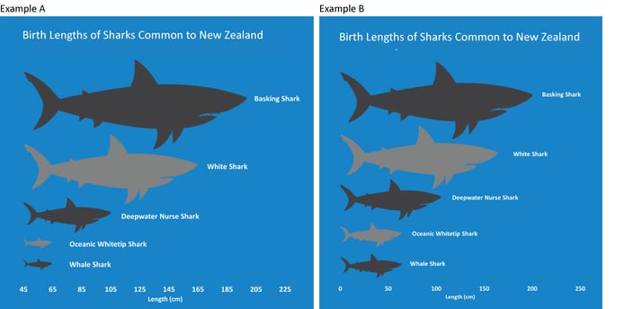
On the left (Example A) is a chart showing the birth lengths of shark species commonly found in NZ[1]. At a first glance, it might appear that when born, basking sharks are 7 to 8 times larger than whale sharks.
A closer inspection of the axis will show that a baby whale shark is only a third of the size of a baby basking shark. You will have noticed that the axis begins at 45 not at zero. The dwarfing effect on the whale shark is further compounded using shark icons in the place of bars. While this makes for a more interesting graphic, it defies intuition because the icons do not actually represent the size of sharks.
Example B is how this information should be presented to allow an objective interpretation. It is arguable how harmful misinterpreting shark size really is, but truncating graphs can be used maliciously.
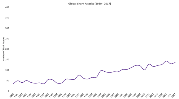
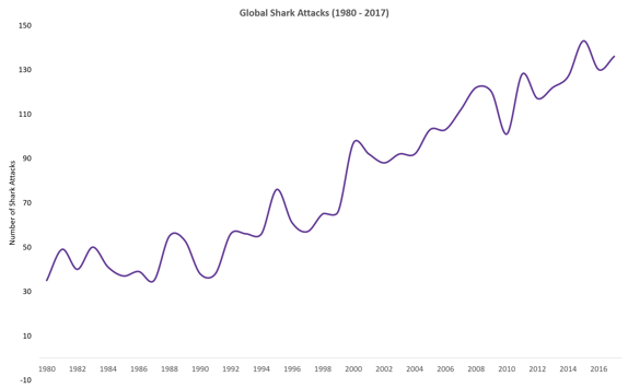
Adding white space to a graph can also play on your prejudices. The graph on the right shows the number of shark attacks globally since 1980[2]. The shallow incline of the curve, created by adding unnecessary padding to the top of the figure with a vertical scale going up to 400 when the highest number on the graph is only 150, dampens the impact of the rise in shark attacks in recent decades.
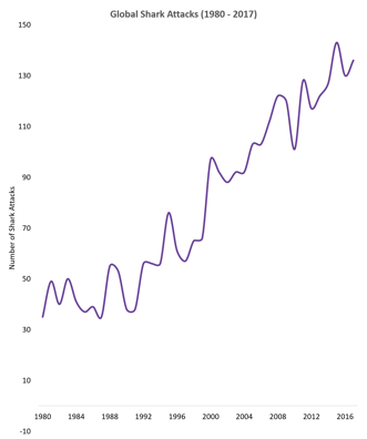
We revised the shark attack graph below, making the vertical axis a more reasonable 0-150, But by shortening the horizontal axis the reader now thinks there's been a dramatic increase. Insufficient room has been left to properly show individual year changes, instead four year blocks are used thus drawing the reader to only the decade-long trends.
A good graph should strive to present all information clearly, without bias, in a manner that is easy to interpret. Our third rendering of the shark attack chart, below, does not overly squeeze, stretch, truncate or pad the timeseries. It gives the reader a blank slate that allows them to draw their own conclusions.
2. Partial Data Series
Cherries
Our second example invites the reader to consider what information might be keeping from your scrutiny. What context is not visible? Is this everything, or am I only seeing a snapshot of a bigger picture?
It is possible to lie while using genuine data by speaking in half-truths. Data can be intentionally included or excluded, cherry-picked to reinforce a chosen narrative.
If you were considering investing in the cherry tree orchard industry in New Zealand, you might be presented with this graph to convince you that cherry production is growing gradually, following a large spike at the start of the millennium[3].
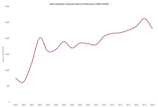
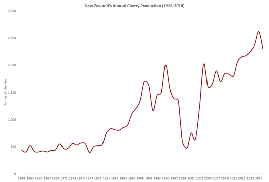
Not exactly a lie, but also not the whole truth. Zooming out to include production statistics from as far back as the 1960s, the market reveals itself to be more volatile.
Cherry-picking is often used by politicians, by selecting the edge cases that support their political agenda. It's also used by climate skeptics, to discredit climate change research and by pharmaceutical companies, ignoring drug trial cases with side effects. If you remember back to 1998. It was used by medical researchers who claimed a (later debunked) link between the MMR vaccine and autism.
The presence of a graph is not always a beacon of honesty.
3. Right tool for the job
Good taste
Every different graph has a specific role to play in analytics. A line chart for understanding trends over time, a pie chart for breaking down parts of a whole, a bar chart for comparing categories, a map for gauging geographic distributions.
The inexpert use of the wrong graph for the job can lead to graphs that make no sense.
Datamine employees (Dataminers) were recently surveyed on their favourite foods. We presented the results as a pie chart.(Pie=food,geddit?)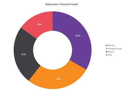
A keen eye would see that the sum of the parts is much greater than the whole, 194% in fact. You would expect a pie chart in percentages to add up to 100%. This one does not. The error comes from the form of research question asked.
If Dataminers had been asked to select their single favourite from the list of four foods, then a pie chart would have been an excellent way to present this data. In reality, the participants were asked whether they liked each food irrespective of the others, meaning a bar chart is a better fit for illustrating the number of yes responses.
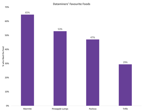
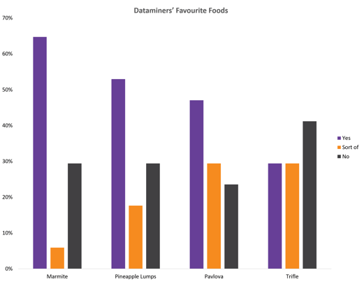
It might be interpreted from this chart that 35% of Dataminers do not like Marmite. But a further check of the research question reveals a new truth, respondents could select between “Yes”, “Sorta” and “No”.
We now have revealed much more detailed data. And it's best presented with all the possible responses, either as a clustered column or a stacked column chart.
Datamine uses graphs to tell a story, but not at the expense of the data. Whether intentional or not, many will continue to show us misleading charts in all forms. Hopefully this introduction to spotting when good data goes bad has given you some elements to add to your data detection tool box for the next time you are reading an article or looking to make a financial investment.
References:
[1] https://www.doc.govt.nz/nature/native-animals/marine-fish-and-reptiles/sharks-mango/
[2] http://www.sharkattackfile.net/index.htm
[3] http://www.fao.org/faostat/en/#data/QC/